Brightn
EXPERIENCE DESIGN

Keywords: Mobility, Commuting,
GOAL
How might we reimagine the commuting experience for young professionals taking BART (Bay Area Rapid Transit)?
TEAM
Andrew LinXie, Katherine Qiu, Manisha Ponniah, Jun Zho, Maggie Chen
MY ROLE
︎ Secondary Research
︎ Prototyping
︎ Visual Design
︎ Interviews
︎ User Testing
OBSERVE & NOTICE
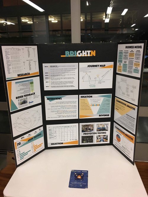
Initial Research
From some quick research on the internet, we learned about the public’s opinion on commuting, what are the common pain points, and especially commuting in the bay area. Here are some of our key insights:
- Driving sucks
- Current status of the BART: a lot of riders are commuters to work
- Increased numbers of commuters: New York and San Francisco had the strongest.
- The average commute time in the bay area is around 30 minutes.
- Worn down public transportation contributes to traffic.
- Health and hygiene are big concerns.
- What affects transportation: colors & art
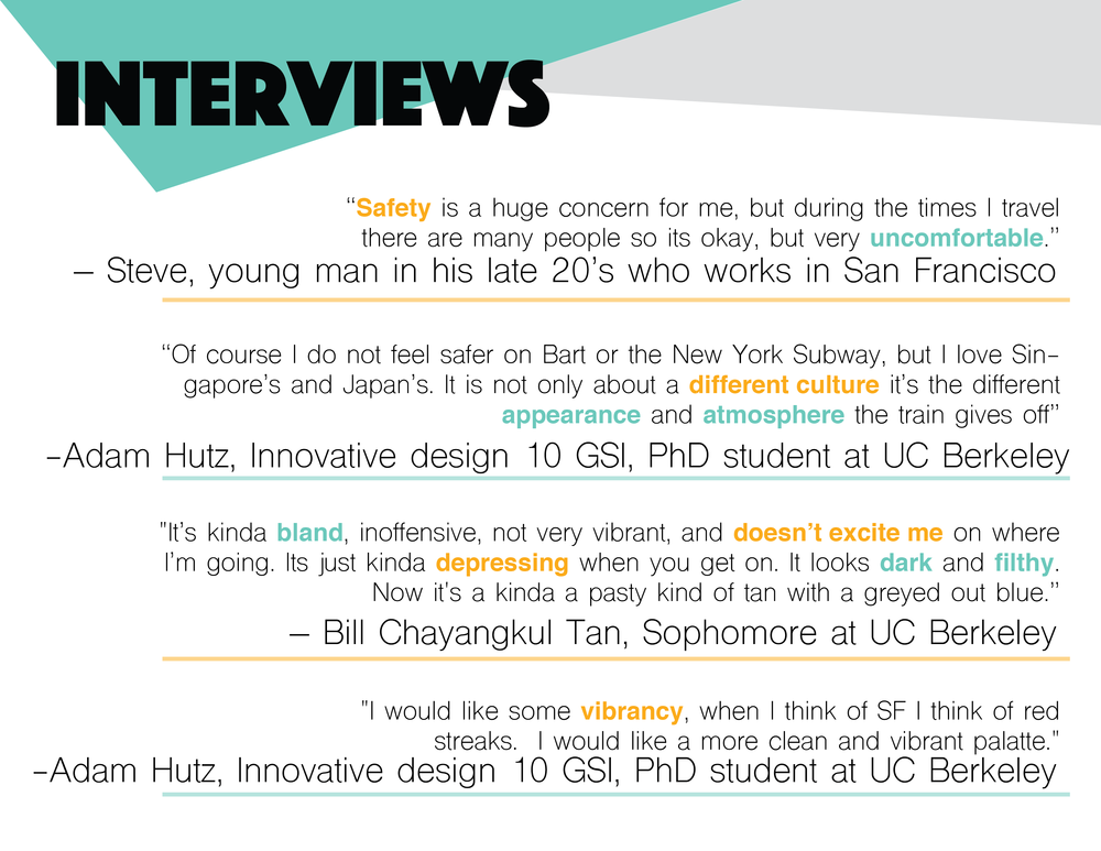
User Interviews
We also conducted interviews with commuters in the age group of 18-30 to understand their experiences with the BART and commuting in general. Here’s what they had to say:
- Safety seems to be a concern - people wants to feel comfortable
- The interior seems dull and depressing
- We can learn from the public transport systems in foreign countries
FRAME & REFRAME
Synthesis to define the problem space
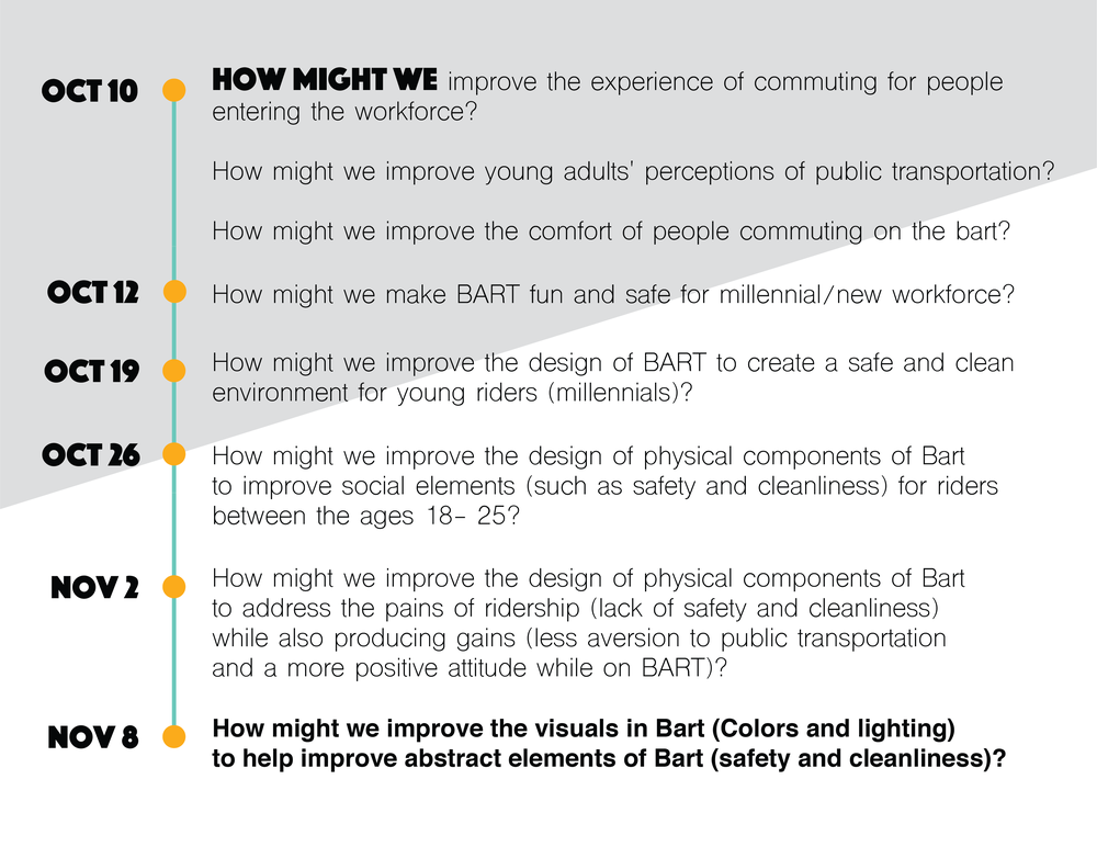
Drawing from the insights gained from our initial research and interviews, we narrowed down our target user group to young adults entering the workforce. After synthesizing, we came to the question: How might we reimagine the commuting experience for young professionals taking public transportation?
Further Research
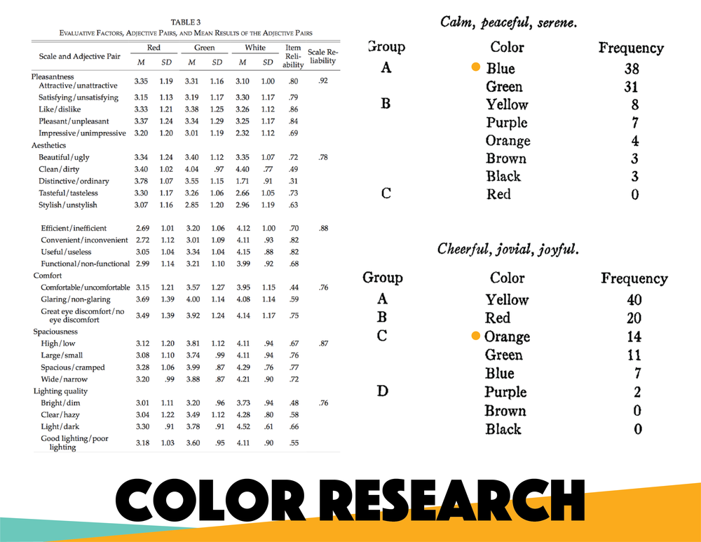
As we continue to develop our idea, we started to focus on the interior aspect of the BART. We did more research to learn about interior visual aspects like lighting and colors to better inform our future design decisions. Here’s a high-level overview of what we found:
- Lighting and crime are related, although different types of lighting can affect productivity and health differently.
- Illuminate: an interesting business that has done some cool LED light art installation.
Since the Bay Area has such a diverse cultural mix, we also learned about some cultural contexts for colors.

Source: Cultural Color Chart
IMAGINE & DESIGN
Persona: Risha
To better understand the needs and pain points of our target users, we built a persona represe the workforce.

Risha
Age: 23
Location: San Francisco Bay Area
Recent Cal grad, Bio-E and Cog Sci major
Current consultant at a biotech consulting company
Daily commuter between Berkeley and San Francisco.
I also wrote a pitch with a short story reimagining Risha's experience with BART after the revamp.
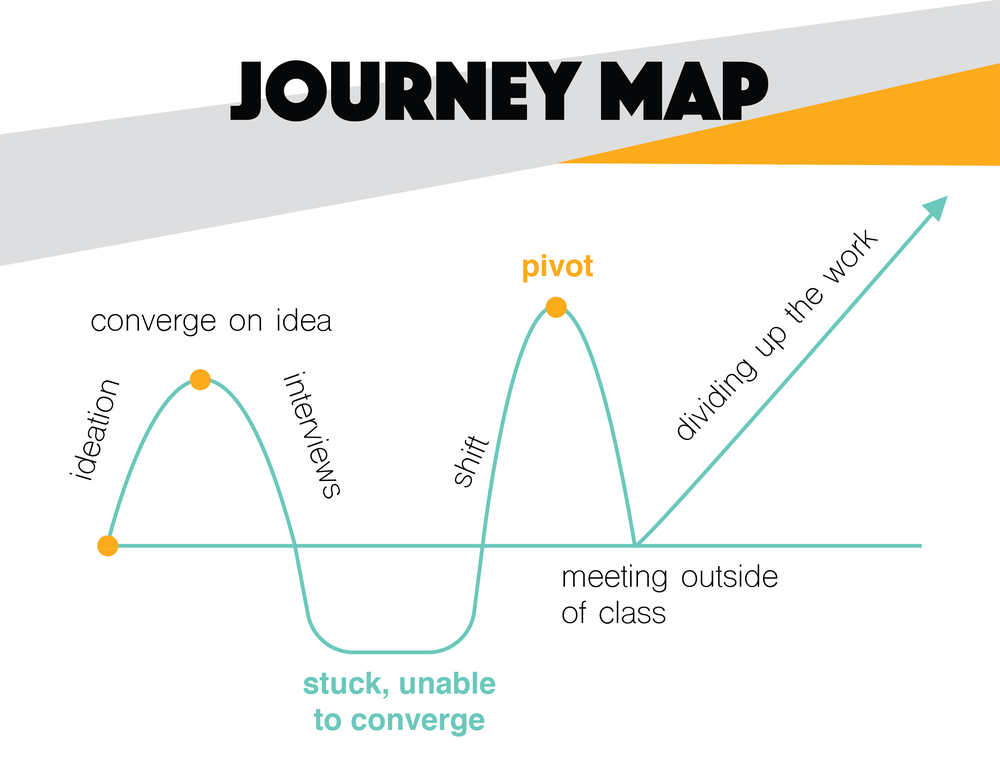
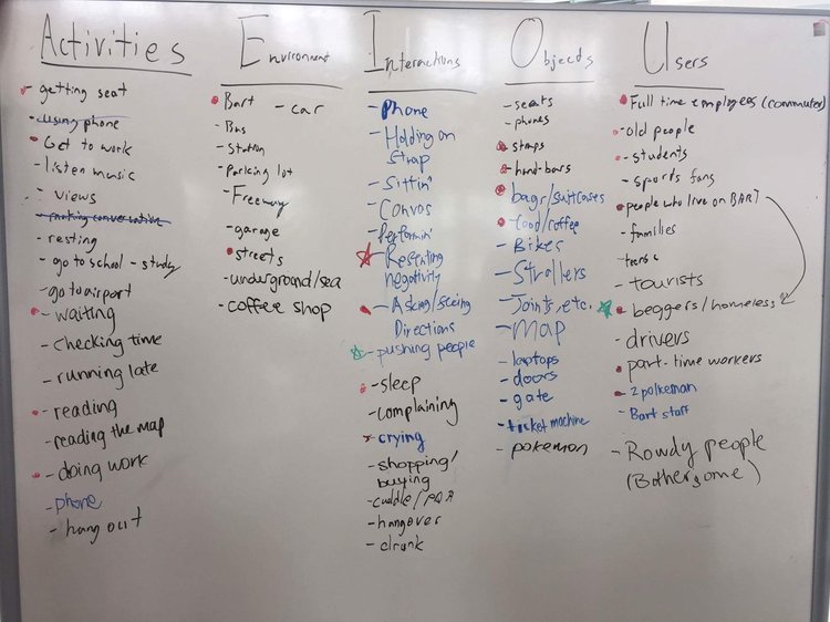
Diverging
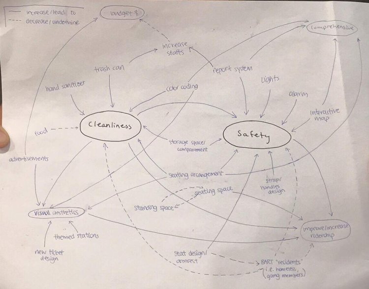
To attempt to solve the problem, we tried to come up with as many ideas as possible using methods like brainstorming, journey map, AEIOU, and system mapping.
INSIGHTS
Converging
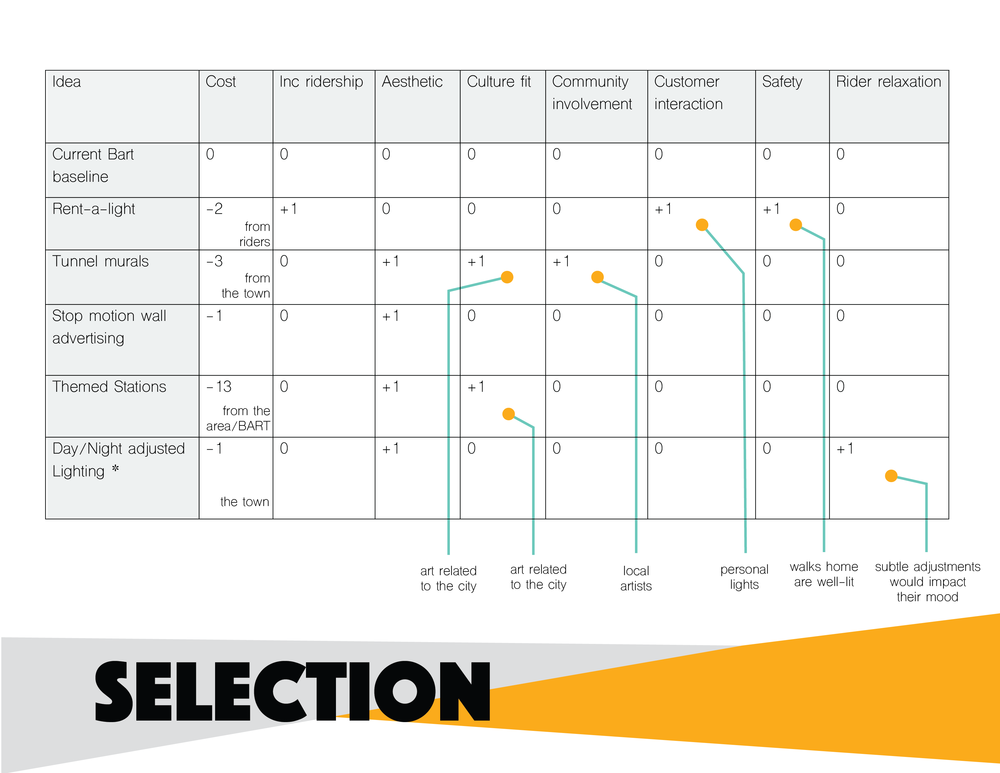
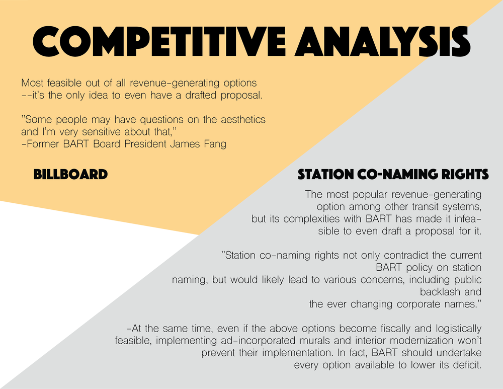
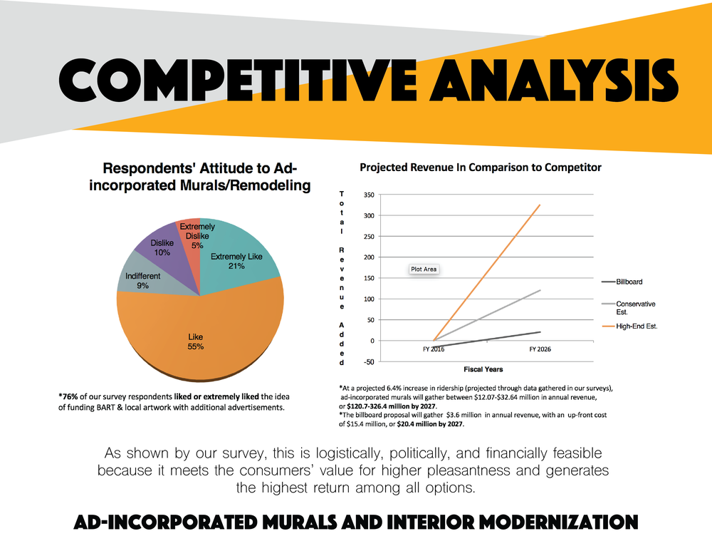
To converge, we used a decision matrix to evaluate the effectiveness of some of the ideas based on the following elements: cost & profitability, visual aesthetics, functionality, space availability, cleanliness, storage capability, accessibility, and comfort.
We also looked at public transit systems in other cities and countries, and discussed what worked and what didn’t.

We decided to focus on the idea of improving perceived aspects like safety, comfort, and cleanliness through changing the visual interior aspect of the BART, especially colors and lightings.
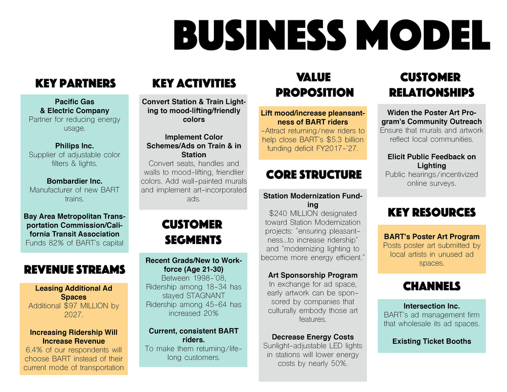
Business Model
To fund and support the revamp of BART interior, we also built a business model, which includes installing murals in the interior of the BART, with sponsored logos from corporate partners like companies in the Bay Area.
The idea here is that the young commuters can enjoy the art and feel empowered as they work toward their goals, while our corporate partners would sponsor part of the revamp project.
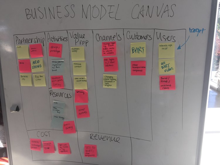
Business model canvas
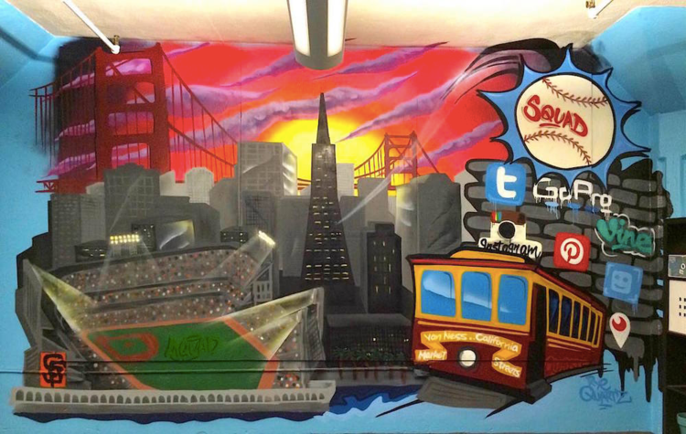
Mural mockup
MAKE & EXPERIMENT
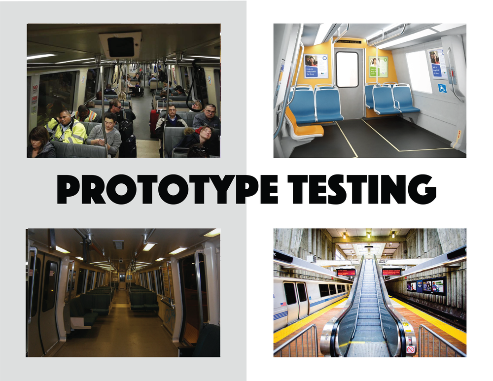
Prototype Testing
After attempts to get in touch with BART officials, in the lack of approval to do prototype testing on the actual BART, we decided to visualize our idea through both digital and physical prototypes.
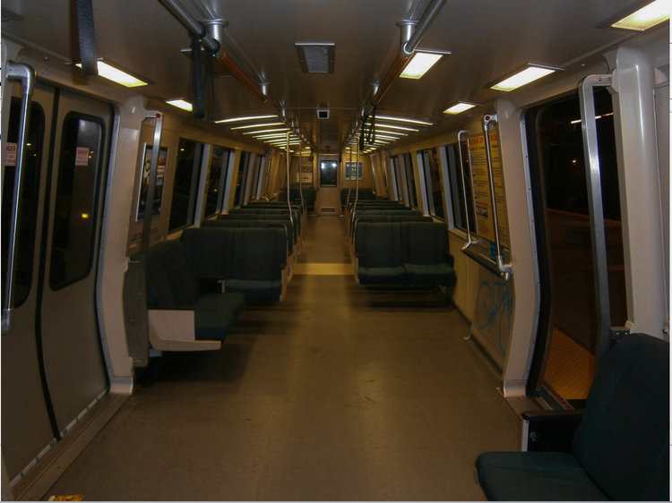
We photoshopped images of the BART interior to demonstrate the difference colors and brighting can make:


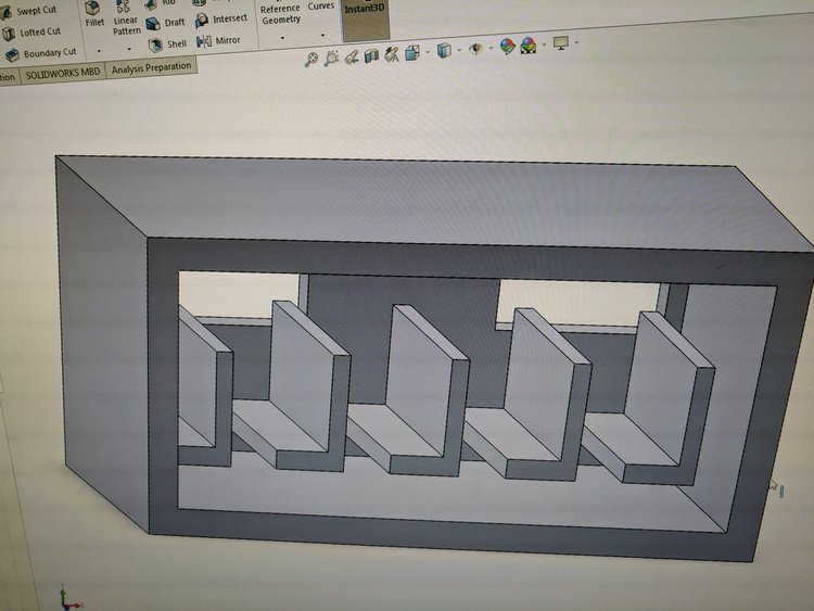
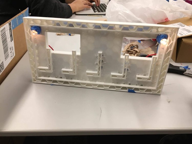
We also 3D printed a small model of the interior to show our idea of improved lighting and colors (unfortunately we have lost the picture of the final product).
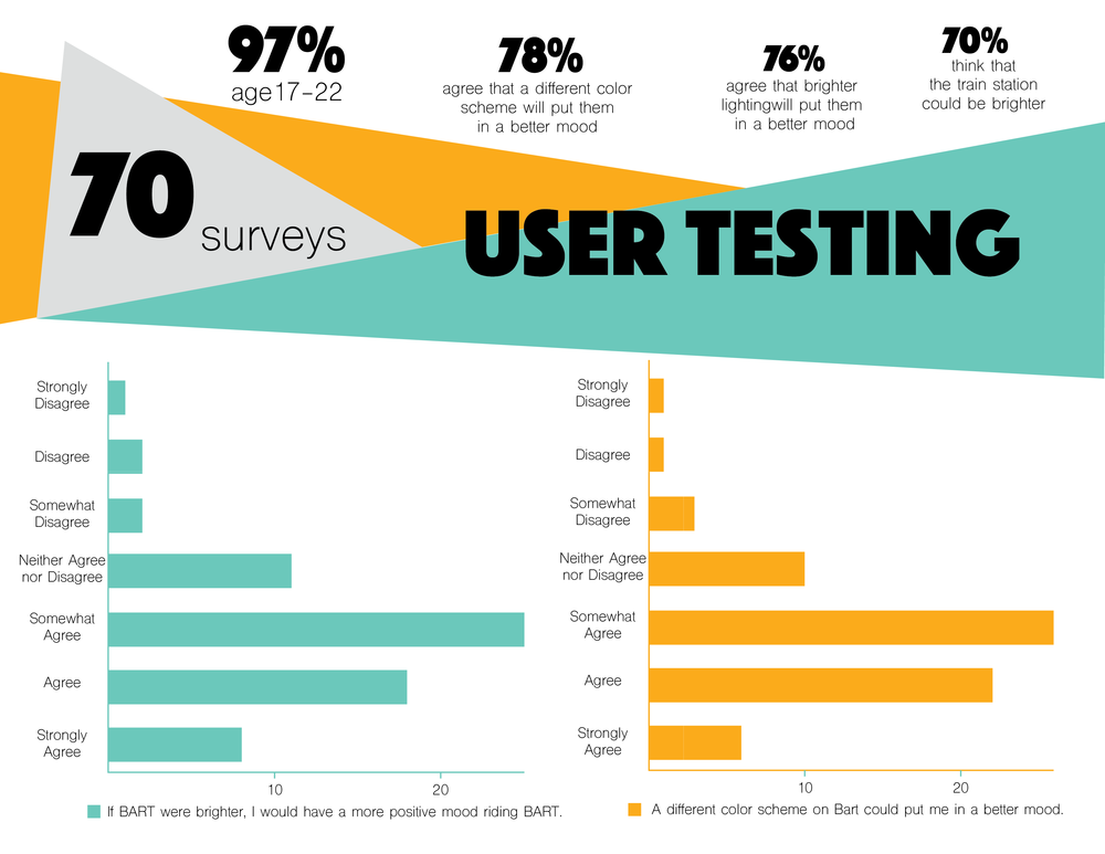
User Testing
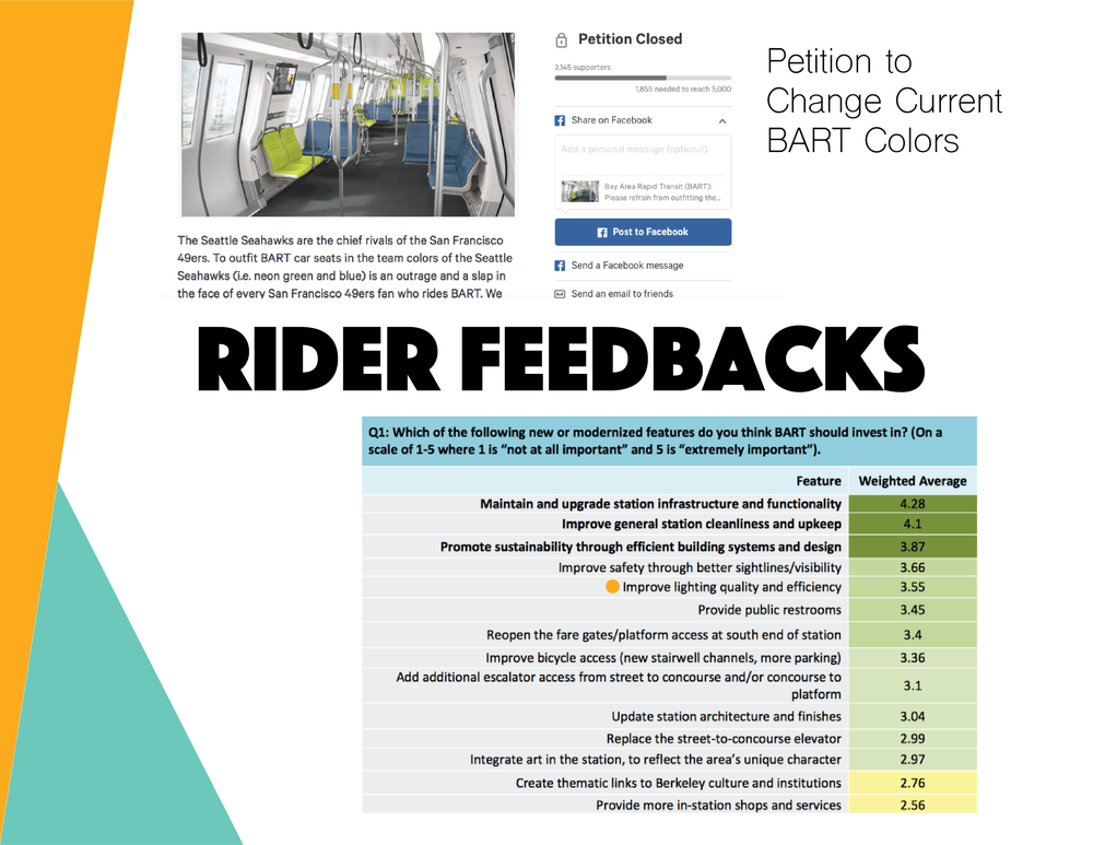
To test out the effectiveness of our idea and collect feedbacks from our target user group, we created an online survey, and distributed it through our social media.
We asked questions like how often do they ride the BART, their main reason of travel, and how strongly do they agree to some statements regarding BART:
- The current color scheme of BART puts me in a positive mood
- A different color scheme of BART could put me in a more positive mood
- A different color scheme of BART could make me feel safer riding on BART
- A different color scheme of BART could make me ride the BART more often redesign were affective, I asked the two users with different amount of usages of Airbnb to use the prototype, and observed their interaction with it.
From the 70 surveys that we've collected, we got an overall positive feedback on a new and improved BART interior:
- 78% agreeing that a different color scheme will put them in a better mood
- 76% agreeing that brighter lighting will put them in a better mood.
MISC
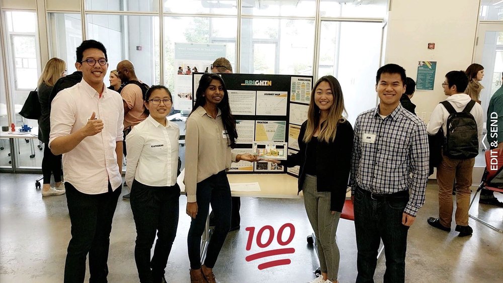
At the end of the class, we presented our project to students, faculties, and industry professionals at the 2016 Jacobs Winter Design Showcase.
We even had the opportunity to speak with a representative from BART, who recognized the problems that we've brought forth, took notes from our project, and gave us some feedbacks on the feasibility of our project.
![]()
![]()
![]()
![]()
![]()
![]()
![]()
![]()
![]()
![]()
![]()
![]()
![]()
![]()
![]()
Presentation
At the end of the class, we presented our project to students, faculties, and industry professionals at the 2016 Jacobs Winter Design Showcase.
We even had the opportunity to speak with a representative from BART, who recognized the problems that we've brought forth, took notes from our project, and gave us some feedbacks on the feasibility of our project.