GOAL
To establish a single source of truth for design components, build consistent patterns of usage, and streamline the process for design and collaboration.
TEAM
Logikcull’s XD Team
MY ROLE
︎ Secondary Research
︎ Design Component
︎ Mockup: Search Table, Billing Table
PROBLEMS
Logikcull’s UI has been evolving with the product, and design elements were built along with new features. There is a lack of standardization which complicated the workflow for both designers and developers. In response to this, we are building a design system - Case, to define and standardize various design components, create a cohesive user experience in the product, and improve efficiencies for individual and collaborative workflows.
Our team followed the process of Audit ︎ Research ︎ Correct when creating a component. This ensures consistency and validity in each component designed, and that every design decision is carefully considered and justified.
PROCESS
Inconsistencies and Lack of Definition
Logikcull’s UI has been evolving with the product, and design elements were built along with new features. There is a lack of standardization which complicated the workflow for both designers and developers. In response to this, we are building a design system - Case, to define and standardize various design components, create a cohesive user experience in the product, and improve efficiencies for individual and collaborative workflows.
Our team followed the process of Audit ︎ Research ︎ Correct when creating a component. This ensures consistency and validity in each component designed, and that every design decision is carefully considered and justified.
PROCESS
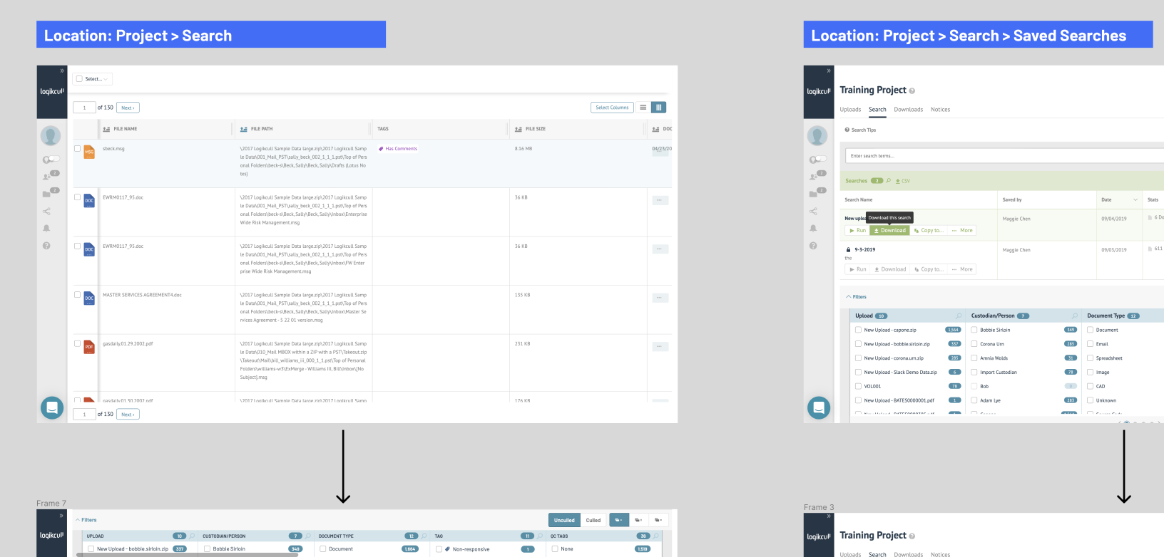
Auditing the Product to Find All the Tables
I audited the product and found 6 locations where the component is currently used. I examined each table and labeled distinct elements in each table like “Header”, “Tooltip”, “Icon”, “Drop-down menu”, etc.
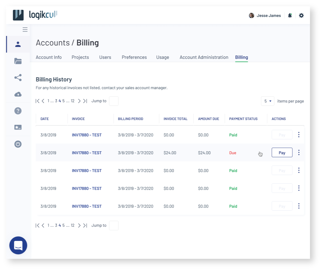
The most complex table is on the main Search screen, where users can toggle between list (default) and table view to sort through files from search and take further actions like culling. There are also other simpler tables on other screens, such as Billing, Notice Template, and Saved Searches, where the table simply displays information and has one or two CTA buttons.
The most complex table is on the main Search screen, where users can toggle between list (default) and table view to sort through files from search and take further actions like culling. There are also other simpler tables on other screens, such as Billing, Notice Template, and Saved Searches, where the table simply displays information and has one or two CTA buttons.
I tallied the number of appearances of each element on different screens and printed them out to pin on a board. I then put post-it notes on the board for:
This helped me visualize inconsistencies among different tables across the product, and allowed me to contemplate the purpose of using a Table component on each screen holistically.
-
Inconsistent use/behavior of elements
- e.g.︎ icon for sorting on screen A, but ︎ icon on screen B -
UI bugs
- e.g. Inconsistent use of colors, font style, etc. -
Redundant use of an element for an action/purpose fulfilled by another element
- e.g. A tooltip for the download button saying “Download” - Any other questions I have about the usage of an element
This helped me visualize inconsistencies among different tables across the product, and allowed me to contemplate the purpose of using a Table component on each screen holistically.
RESEARCH
To better understand what goal does the user want to achieve from using a table, I turned to user research. Anahid, a senior product designer on the team, had already done some research on Tables in the product, and after looking through her research, I synthesized some key insights: e.g. users prioritize action buttons over other elements in a table, and they also care a lot about the File Paths and Tags.
What I found is that the Search Result table view might be underutilized even though it takes up over 40% real estate on screen when it’s switched on in the Search page.
Quant and Qual User Research: Understand Table Users
To better understand what goal does the user want to achieve from using a table, I turned to user research. Anahid, a senior product designer on the team, had already done some research on Tables in the product, and after looking through her research, I synthesized some key insights: e.g. users prioritize action buttons over other elements in a table, and they also care a lot about the File Paths and Tags.
What I found is that the Search Result table view might be underutilized even though it takes up over 40% real estate on screen when it’s switched on in the Search page.
Assumption: Most users clicked on the toggle button out of curiosity. Users who clicked on it at least 3 times in a single session are actually using the table view.
To validate this assumption, I played around with Amplitude - our analytics platform, to learn about different action sequences of the table view users and found that some of the most common sequences seem to agree with that assumption. Turns out, there were a lot of 1-time users who click on the toggle once, and the number of users dropped drastically with the number of clicks, which validates my assumption.
I also reached out to a product manager to get in touch with some of the super users (those who click on the table view for >5 times in a session) of the table view. I planned to conduct short interviews with them to get qualitative insights about how they use tables, but unfortunately, with a small pool of table users, I did not execute the interview plan.
I also reached out to a product manager to get in touch with some of the super users (those who click on the table view for >5 times in a session) of the table view. I planned to conduct short interviews with them to get qualitative insights about how they use tables, but unfortunately, with a small pool of table users, I did not execute the interview plan.
Secondary Research: Understand Tables
Along with user research, I also conducted secondary research on the undernet to understand how tables are used and defined by others. Some of the most helpful ones are design systems for other products: VMWare’s Clarity Design’s Datagrid, Google’s Material Design’s Data tables, Shopify’s Polaris’ Data table, Quickbook’s Design System’s Tables, IBM’s Carbon Design’s Data table.
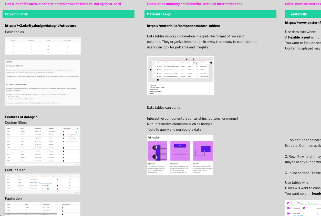
I compiled them together, and extracted key elements of a Table component (a.k.a. Data Table) to form the following guidelines for Table usage in our design system:
DELIVERABLES
After extensive research on what Tables are, I incorporated my findings into the current usage of tables in the product and explored various features and behaviors in mockups. Here is a closer look at some of them:
Use a table to display a large amount of content in a structured manner, using mainly text, numbers, and icons, with minimal visual assets.
The rule of thumb is whether this information can be easily grouped into rows and columns so that each row represents an object that has similar attributes to the other objects displayed. The goal of using a table is to allow users to quickly scan and digest the information in each cell, and compare across rows and columns.
DELIVERABLES
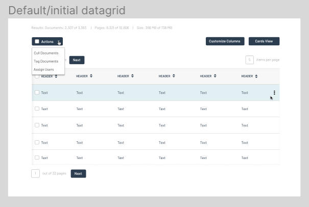
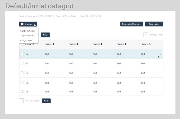
Table Features and Behaviors
After extensive research on what Tables are, I incorporated my findings into the current usage of tables in the product and explored various features and behaviors in mockups. Here is a closer look at some of them:
Default Style
Drop-down combo button for users to take batch actions on mass selection.
Row-specific actions are collapsed under a “kebab” menu, which will be visible upon hover.
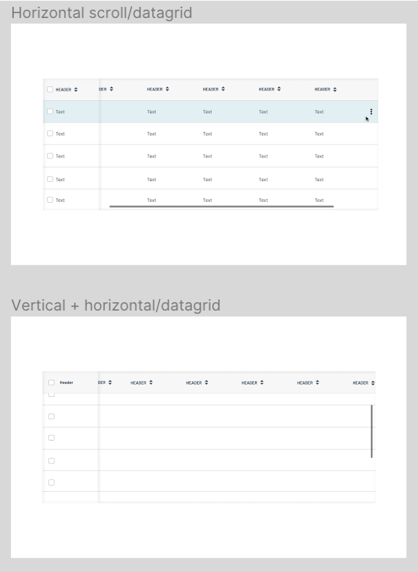
Scrolling
When the table contains a large volume of complex data, it can be scrolled horizontally, vertically, or both at the same time.
The first row is fixed when scrolling vertically, and the first column is also fixed when scrolling horizontally.
Divider
For complex tables, there are vertical dividers in the header row to indicate customizable width for the table.
Expandable Rows
For a clean view of tables with a lot of textual information, I explored the options of expandable rows.
Upon clicking the small triangle on the left of the checkbox for each row, the user can view/hide more information about the item displayed in the row.
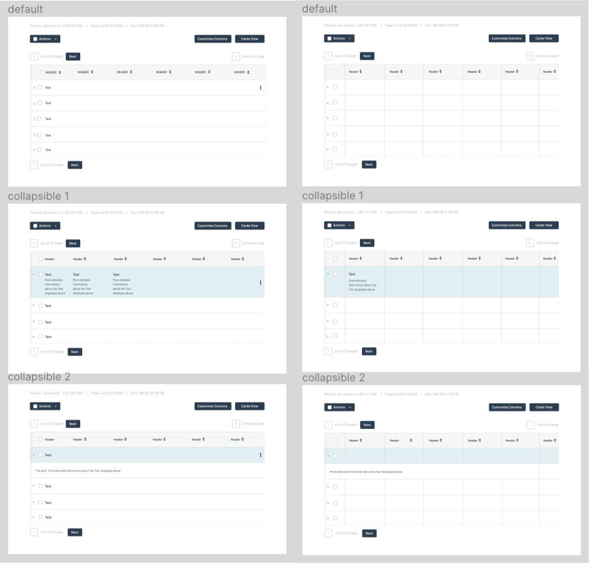
Default / With Divider
Other Features
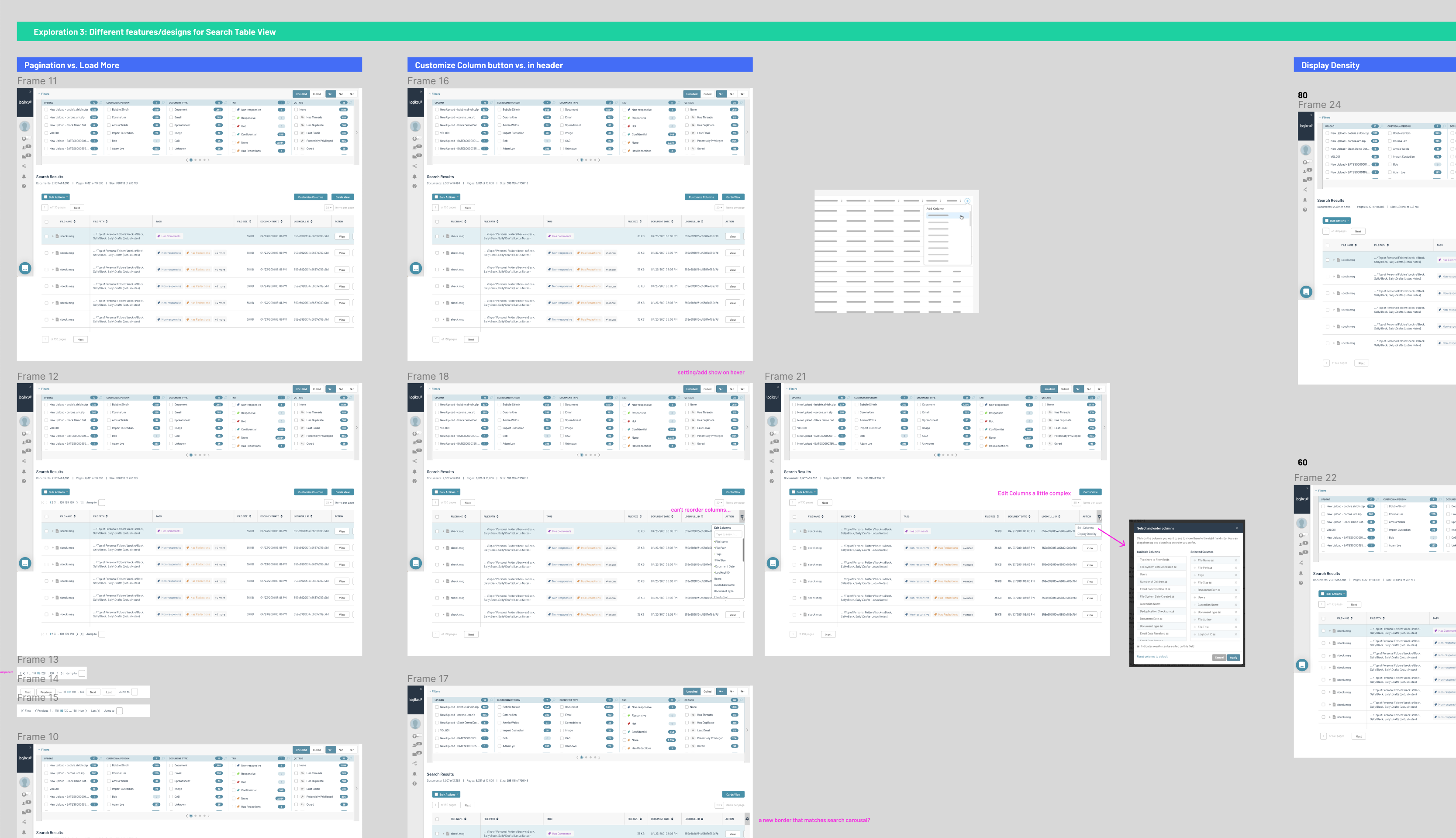
Pagination vs. Load More, Customization options as buttons above the table vs. in the header, and Display Density.
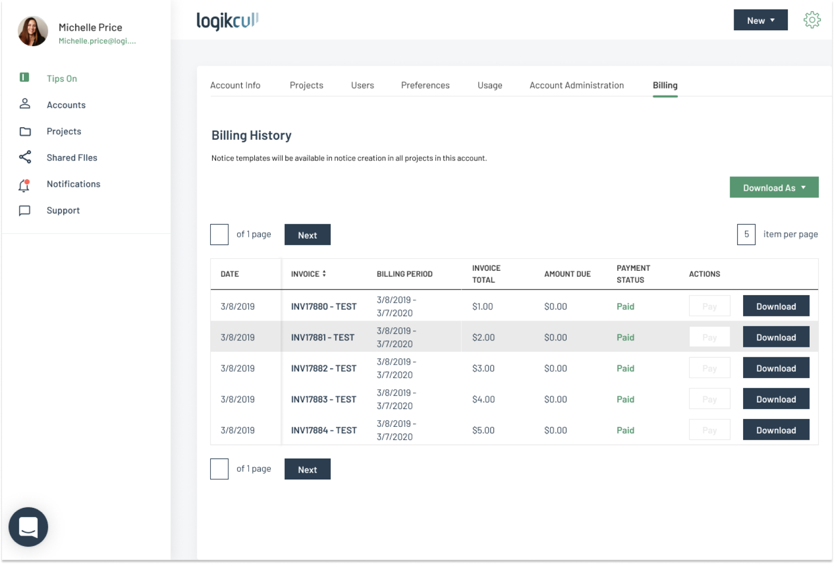
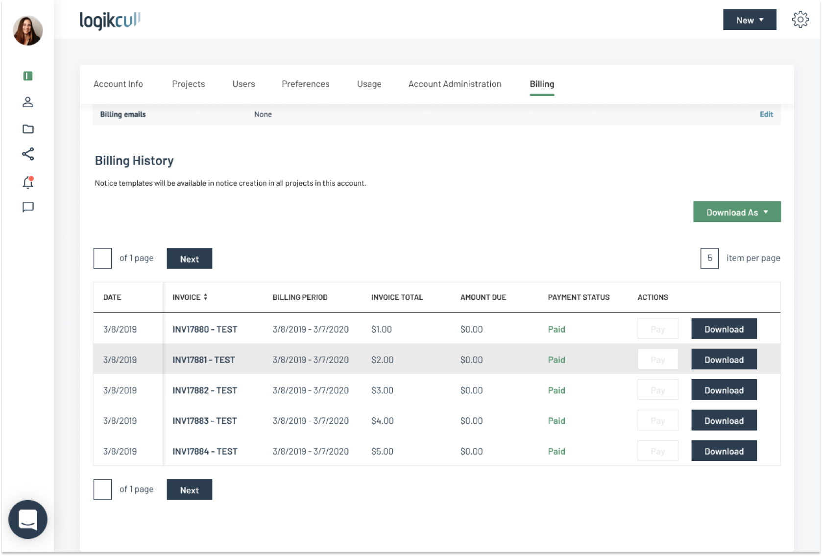
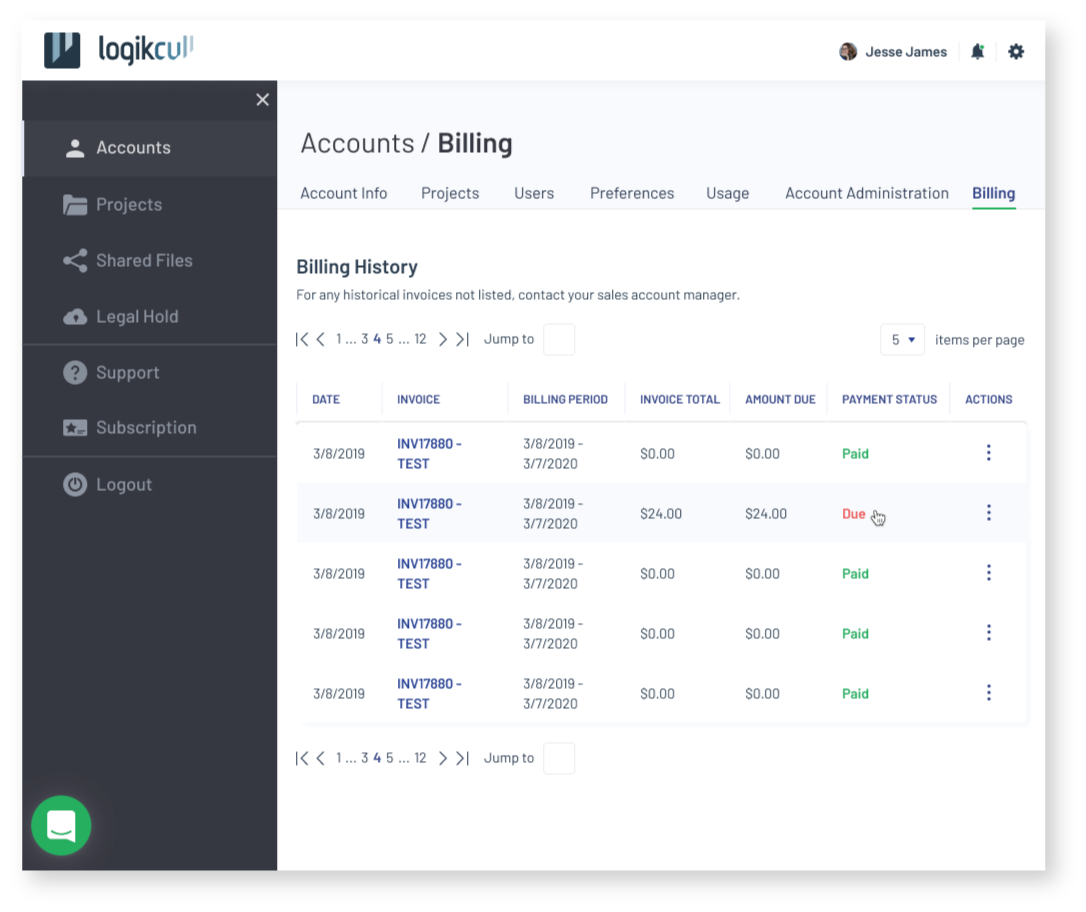
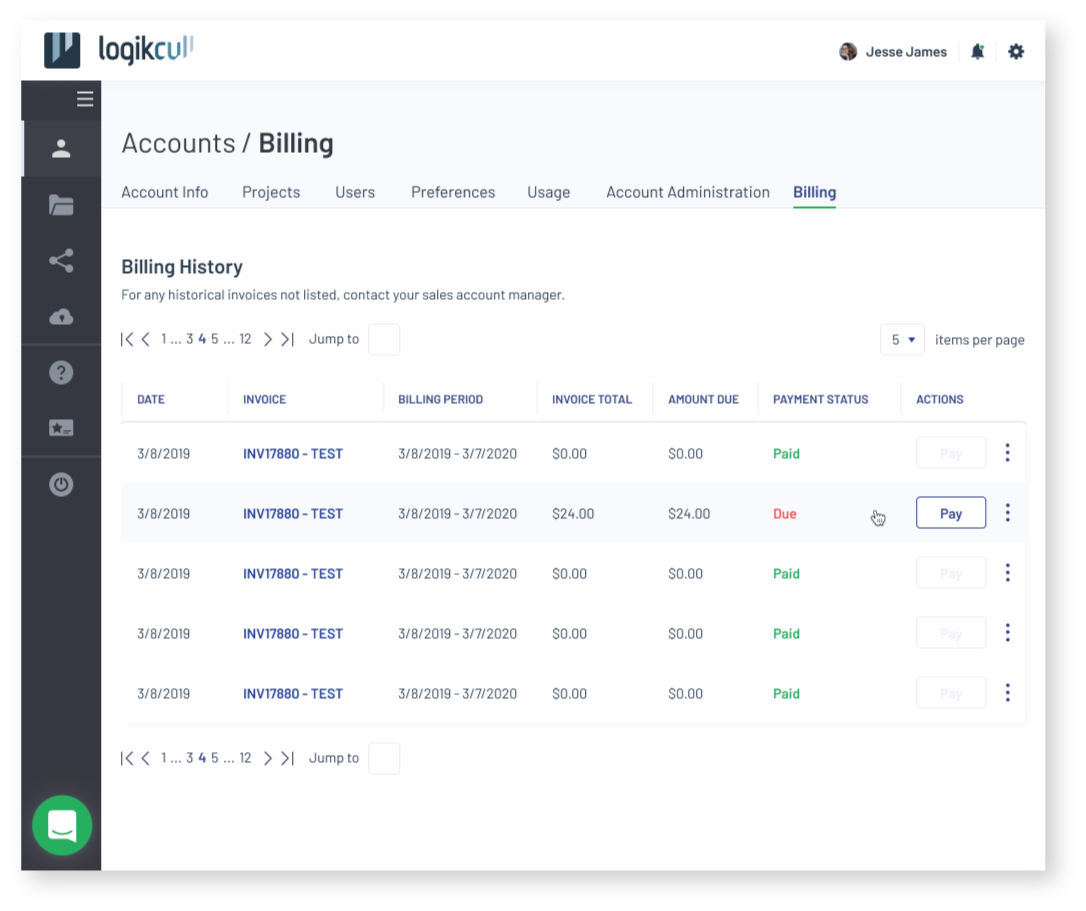
Redesigned Billing Table Mockup
I also designed mockups for the Billing page as a part of the redesign effort for the product, incorporating different themes and color palettes from brainstorming sessions and workshops.
Soft Gaze (Dark Nav)
![]()
![]()
Soft Gaze (Light Nav)
![]()
![]()

Clear Gaze
![]()
![]()