ReTouch
class project @ Harvard GSDTo design a sensory accessory kit that helps people escape from stress-inducing scenarios.
TEAM —
Maggie Chen, Michele Chen, Snow Xu
︎ User Research: Interviews + Usability Testing
︎ Mobile UX
︎ Digital Prototype
KEYWORDS —
Responsive environment, mental health, stress, escapism

GENERATIVE RESEARCH —
The Psychology of the Bathroom
We started our project by researching different mentalities people have in private, shared private spaces, semi-public spaces, and public spaces. We surveyed people about the different activities they do while being in a private home bathroom vs. a public bathroom, and received over 50 responses.
This helped us understand how people use their time in the bathroom to de-stress or escape from undesired sources of stress, which prompted us to design a product that would replicate some aspects of the private bathrooms, including senses of relief and escapism.

We asked people how they spend their time in the bathroom (when they are not tending to their biological needs) and how do they feel when performing such activities like scrolling on phones, reading, singing, checking themselves out, etc.
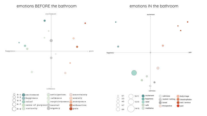
Synthesis: People’s emotions before/in private bathrooms
Interviews
We then conducted in-depth interviews with 3 of the survey respondents to learn more about their habits in bathrooms, sources of stress in semi-public and public spaces, and how they tend to cope with them.
Target User
We are targeting people who are prone to feel stressed in public or semi-public spaces, those who may or may not realize that they are stressed but seek to escape the source of stress in their surrounding environment.
Our target user owns and uses a smartphone. They are comfortable with carrying and putting on a lightweight wearable device in public or semi public spaces.
Based on our exploratory research and brainstorming, we decided to create a kit to help people escape from various stress-inducing scenarios, featuring a mobile app for guided self-care and a tactile stimulation glove for pressure therapy and fidgeting.
PROCESS —
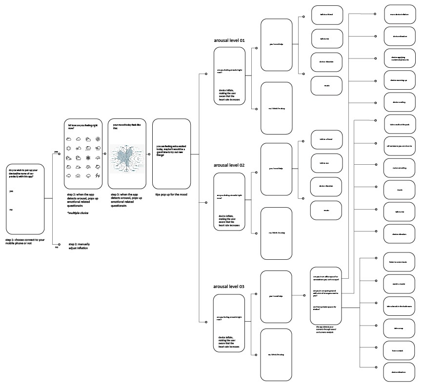
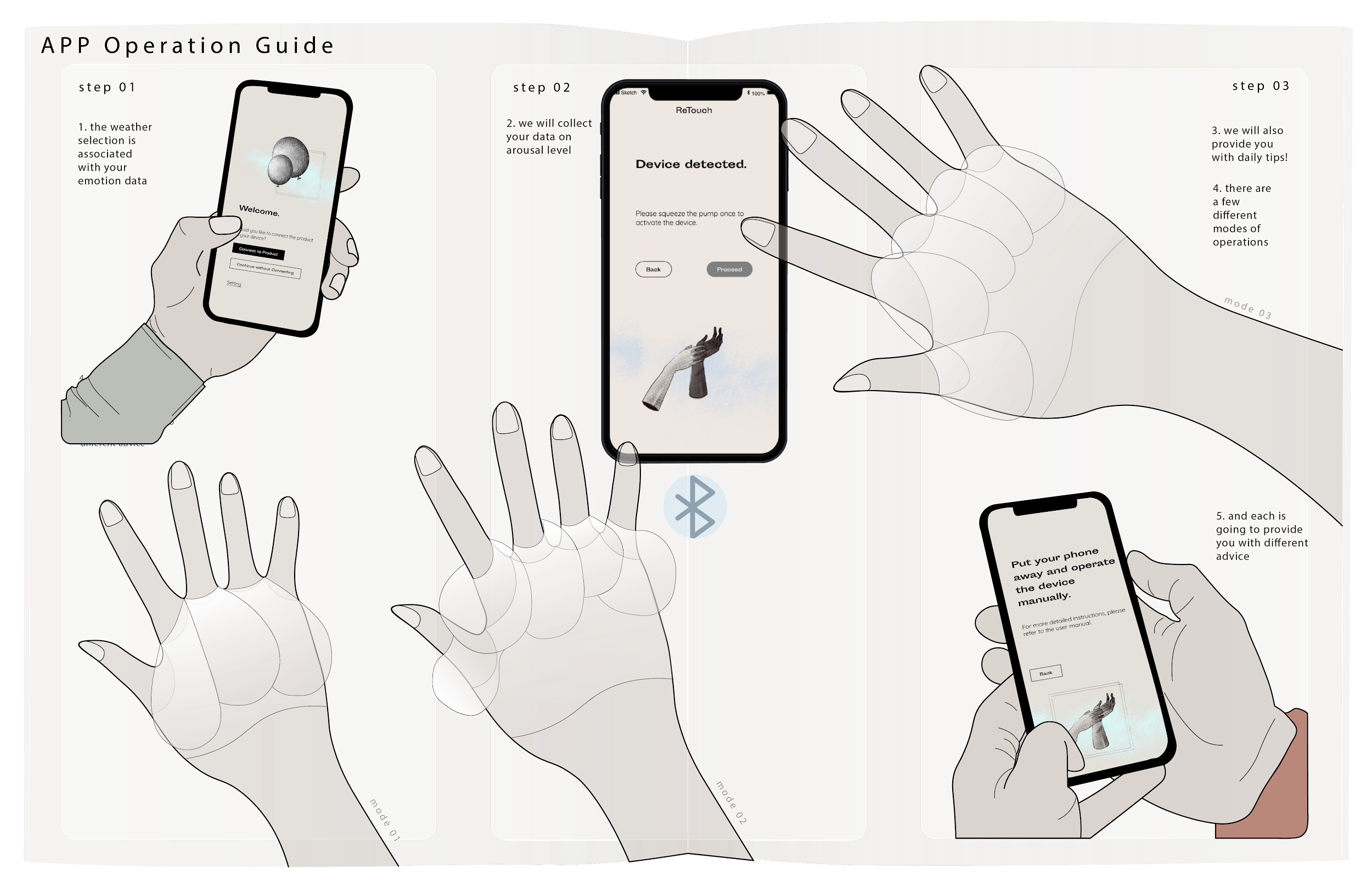
User Flow
We started off by sketching out a diagram of user flow to highlight key frames and features, which also illustrates how the mobile app would be used along with the wearable device.
Wireframes
Based on the user flow, I sketched out simple wireframes for the app, and differentiated two parts of the app’s flow:
- A first
time use flow helping the user set up the app when they uses it for the
first time
- A regular flow that guides the user through procedures of self-care through recommending features based on the user’s mood, arousal level, and their surrounding environment.

Mockups and Visual Aesthetics
We wanted to stray away from approaching this as a clinical product and avoid providing any diagnostic prescription for the user because our product serves as a temporary relief rather than a solution to mental health issues. People are recommended to seek professional help rather than relying on our product should they need to. This is achieved through making intentional decisions for both visual and UX design, including:
- Choosing a san serif typeface with wider proportions and wonky, off-kilter letterforms for headings in the app

- Incorporating quirky illustrations and pastel colors into the UI

- Features like gradient color maps generated based on a quiz that gauges the user’s current mood, along with an inspirational quote for the day, inspired by the concept of psychological affirmation in astrology apps

Interactive Prototype
Based on the user flow, wireframes, and mockups, I created an interactive prototype for the mobile app on InVision.
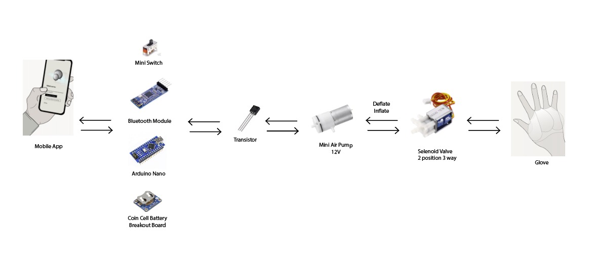
Physical Protoyping: Wearable Device
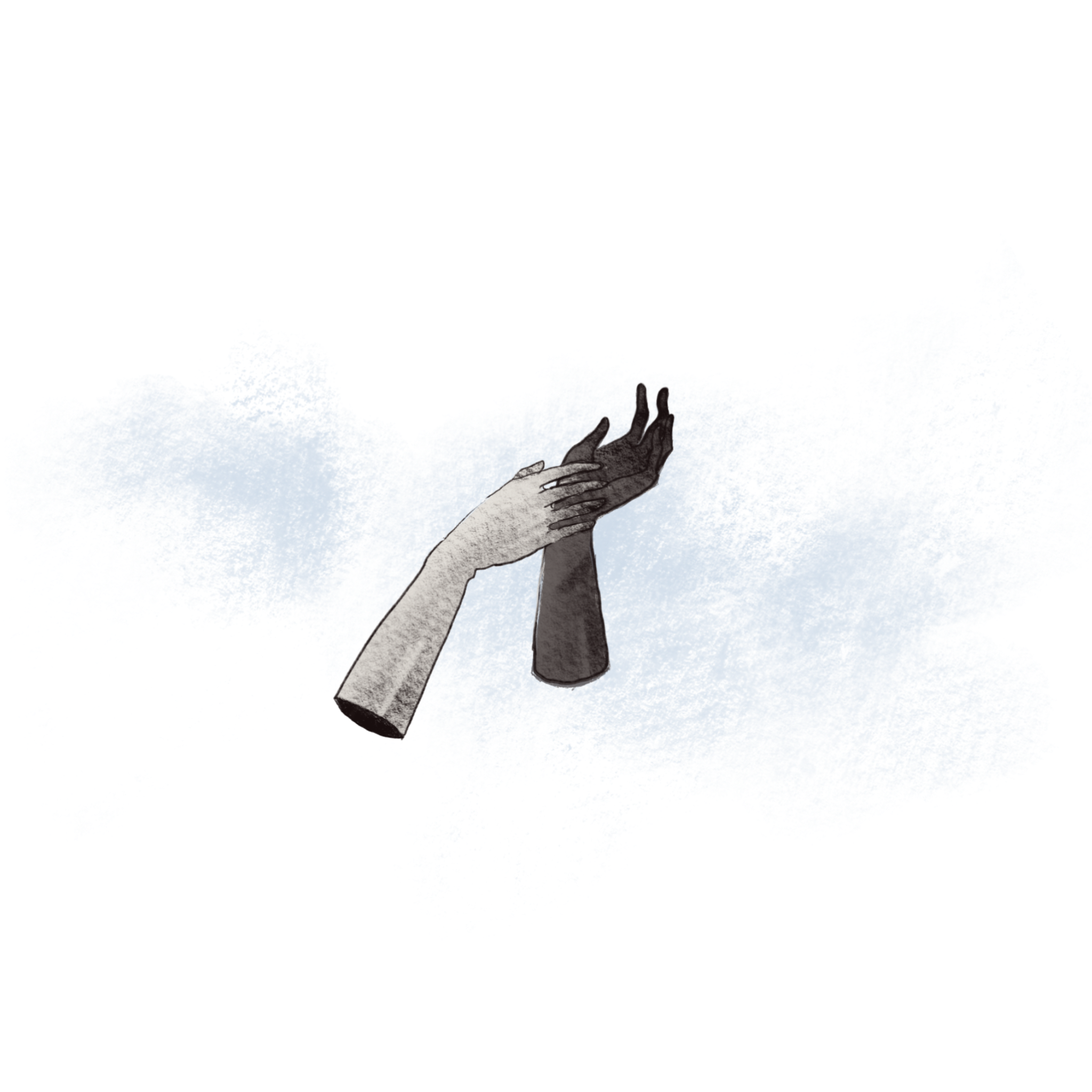
For the wearable component, inspired by some of the precedents in the design and art field that incorporates tactile pressure to induces a sense of pacification and relaxation, we design a tactile stimulation glove made out of an array of inflatable units around the palm and fingers.
The glove would inflate and deflate to provide moderated pressure on the hand. It’s almost like someone holding your hand tightly.
The glove can be either manually inflated or automated via Bluetooth connection to the app. Below is a diagram that explains the electrical components that would enable that.


USER RESEARCH —
Usability Testing
Lastly, we conducted 4 usability tests for the app with participants who fall under our target user group, with the following research questions:
- Can the user gain basic understandings of how the product works based on unsupervised walk-through of the the app? (With the exception of a few screens where the mobile and wearable prototypes are not fully realized yet)
- Does the First Time Use workflow provide clear enough information to help the user set up the mobile app?
- Can the user intuitively understand how the wearable device functions with the mobile app?
- Does the wearable device function as a standalone product without the mobile app?
We asked each participants to complete the following tasks:
- Complete the color matching quiz and set up the mobile app as a first-time user.
- Use the wearable device without connecting it to the phone.
- In the scenario when the user is in an office space with access to a bathroom nearby, use the wearable device with connection to the phone, and activate level 1 device inflation once.
After testing it out, we found some minor usability issues during the weather quiz, for example, people expect there to be an emotion to be associated with the weather icons, so we added labels for them.
Though the participants were a little confused around screens involving interactions with the wearable device, since we were not able to test with the device, overall, we received positive feedback on the flow of the app. They found most tasks easy to complete, instructions in the apps were easy to follow, and people liked the animation in the inflation feature.
REFLECTION —
Moving Forward
Currently, our project is not a complete toolkit in itself yet, and we acknowledge that there is space to further refine the UX, such us the association between color and users arousal level, how that impact the color palettes used in the app. Additionally, there is space of exploration in how the digital and analog components of the project can work together or independently.
We were inspired to make this project because we believe it’s important to talk about the management of mental health and self-care in today’s tech-saturated society and fast-paced work culture. We want to explore ways of how design affect one’s mental well being and create psychological space for comfort and peace.